How to Build a Brand System for Digital Products
Design alone doesn’t build trust, consistency does. In this article, Amra and Sanjin explore how unified brand systems connect design, UX, and communication, helping digital products feel familiar, reliable, and instantly recognizable across every platform.

Building a digital product involves more than just designing a logo or picking a color scheme. In today's landscape, users interact with brands across websites, apps, and many digital platforms. Consistency across these touchpoints shapes how users remember and trust a brand.
A brand system for digital products helps keep every part of the experience aligned, from the way screens look to the way messages are written. It connects visual identity, design patterns, and the tone of communication. Understanding what goes into a brand system makes it easier to create digital products that feel familiar and reliable to users.
Digital products in 2025 are expected to deliver seamless, meaningful experiences. This relies on more than visual elements - it also includes how users interact with the product and how the product "speaks" to them.

What Is A Brand System For Digital Products
A brand system for digital products is a collection of visual, interactive, and communication rules that work together across all digital touchpoints. Think of it as a playbook that tells everyone on your team how your product looks, sounds, and behaves.
Unlike traditional branding that focuses on print materials, a digital brand system covers UI patterns, button styles, micro-interactions, and the product's tone of voice. It guides designers and developers in making choices that stay consistent across web, mobile, and other platforms.
When someone uses your app, visits your website, or receives an email from you, they experience the same brand personality. This consistency helps users recognize your product instantly and know what to expect from each interaction.
Why A Cohesive Brand Experience Drives Growth
Brand consistency means your product looks and feels the same everywhere users find it. When your website uses blue buttons and friendly language, your mobile app uses the same blue buttons and friendly language too.
This repetition builds recognition. Users start to associate certain colors, fonts, and ways of speaking with your product. They develop expectations about how interactions will work and what kind of experience they'll have.
Fragmented experiences confuse users. If your website feels professional but your app feels playful, users wonder if they're using the same product. This confusion weakens trust and makes it harder for people to remember what makes your product special.
Companies with consistent branding across all platforms see higher user retention rates. When users can predict how your product will behave, they feel more comfortable using it regularly.
Start With Strategy Purpose Audience And Value Proposition
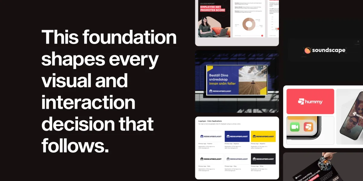
Before choosing colors or fonts, you need to understand who you're building for and why. This foundation shapes every visual and interaction decision that follows.
Map Your Target Users
Start by researching the people who will actually use your product. Look at their demographics, behaviors, and the problems they're trying to solve. Create user personas that represent your typical customers.
- Demographics: Age, location, occupation, income level
- Behaviors: How they use technology, when they're most active online, what devices they prefer
- Pain points: What frustrates them about current solutions
- Emotional drivers: What motivates their decisions and makes them feel confident
These insights help you decide whether your brand should feel serious or playful, simple or sophisticated.
Articulate Mission And Vision
Your mission explains what problem your product solves right now. Your vision describes the bigger change you want to create in the world. Both statements guide how your brand communicates across different touchpoints.
A clear mission helps your team make consistent decisions. When someone asks "Should we use formal or casual language here?" you can refer back to your mission for guidance.
Craft A Unique Value Proposition
Figure out what makes your product different from everything else in the market. This isn't just about features - it's about the unique benefit users get from choosing you over competitors.
Your value proposition becomes the foundation for all brand messaging. It helps you decide what to emphasize in your visual identity and how to talk about your product.
Visual Identity Essentials For Web And Mobile Interfaces
Visual identity includes all the elements users see when they interact with your product. These elements work together to create a recognizable look that supports your brand strategy.
Logo and Iconography
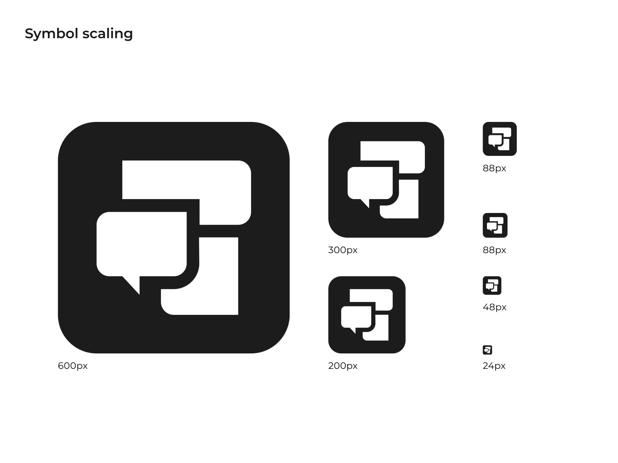
Your logo needs to work at different sizes, from large desktop screens to tiny mobile notifications. Design it to be clear and recognizable even when it's very small.
Icons follow the same visual language as your logo. They use similar shapes, line weights, and styles so users can tell they belong to the same system. A consistent icon library makes navigation more predictable.
Color Palette And Contrast Ratios
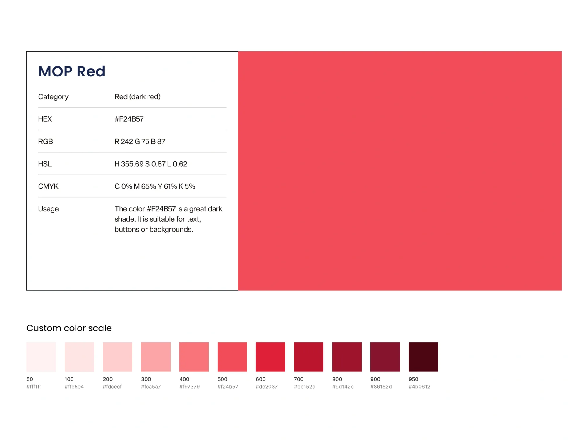
Choose primary and secondary colors that reflect your brand's personality and meet accessibility standards. Test all color combinations to ensure text remains readable for users with different types of vision.
- Blue: Communicates trust and reliability (common in fintech)
- Green: Suggests growth and sustainability (popular in health apps)
- Red: Creates urgency and excitement (used in food delivery)
- Purple: Implies creativity and innovation (seen in design tools)
Color contrast ratios determine how easy text is to read. WCAG AA standards require a 4.5:1 ratio for normal text and 3:1 for large text.
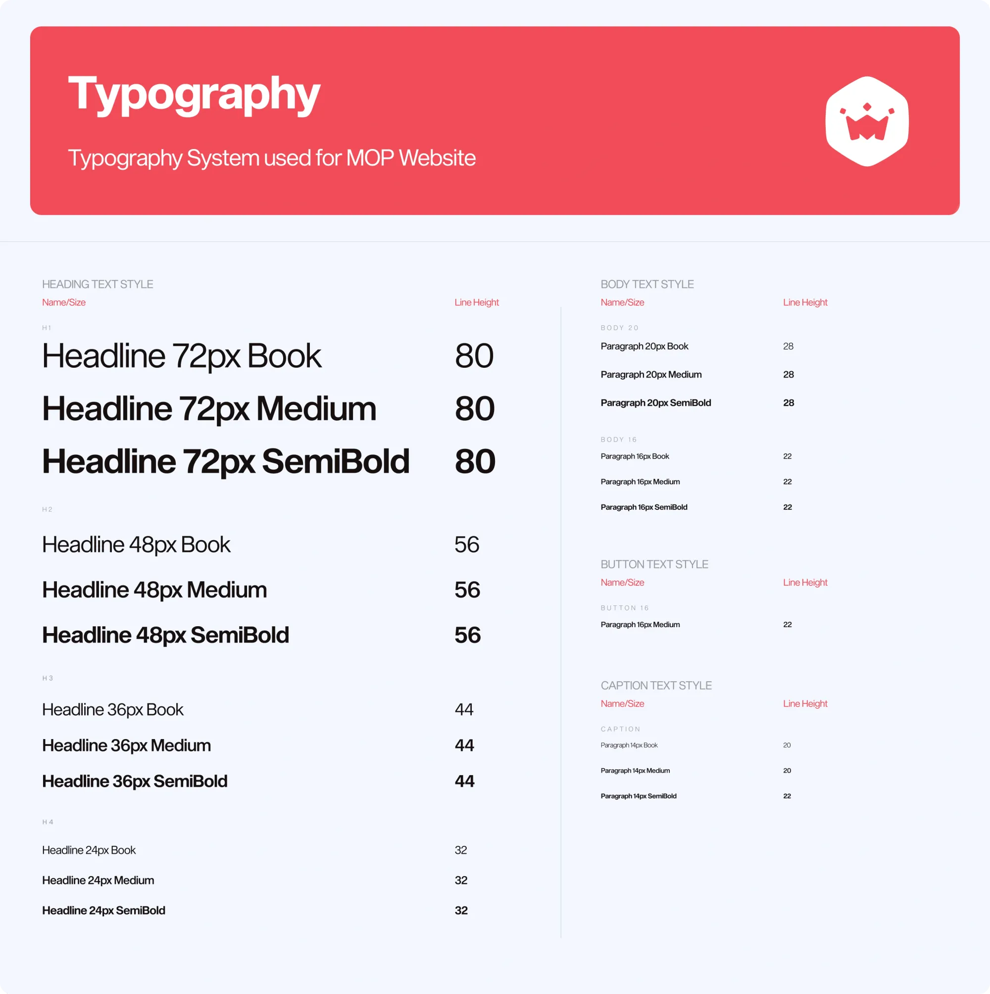
Typography And Readability
Select fonts that work well on screens and support the languages your users speak. Establish a hierarchy using different sizes, weights, and spacing so users can quickly scan information.
Your typography choices communicate personality just like colors do. Rounded fonts feel friendly and approachable. Angular fonts suggest precision and efficiency.
Motion And Micro Brand Elements
Animations and transitions reinforce your brand character through movement. Define how buttons respond when tapped, how screens change, and how loading states behave.
Keep animations fast and purposeful. They work best when they help users understand what's happening rather than just looking decorative.
Bring The Brand To Life Through UX UI Patterns And Micro Interactions
Your brand system extends beyond static visuals into how users interact with your product. Every tap, swipe, and click is an opportunity to reinforce your brand personality.
Onboarding Flows
New users form their first impression during onboarding. Use this opportunity to demonstrate your value proposition while introducing your visual identity and tone of voice.
Show users what makes your product special through clear language and consistent visuals. Make the experience feel welcoming and aligned with the brand personality you've defined.
Voice Tone And Micro Copy
Micro copy includes button labels, error messages, form instructions, and notifications. These small pieces of text add up to create your product's voice.
Develop writing guidelines that define how your brand sounds. Decide whether you use contractions, how formal your language is, and what words you avoid. Consistency in these details makes your product feel more human and trustworthy.
Feedback And Error States
System responses and error messages are often overlooked but crucial for brand consistency. When something goes wrong, users pay extra attention to how you handle the situation.
Use these moments to reinforce your brand voice. A playful brand might say "Oops! Something went sideways." A professional brand might say "We're experiencing a technical issue and working to resolve it."
Step By Step Framework To Build And Launch Your Brand System
Building a brand system requires coordination between design, development, and content teams. Follow this framework to organize the work and ensure nothing gets missed.
Step 1: Audit Existing Assets
Collect all current visual elements, content, and UI components from your product. Look for inconsistencies in colors, fonts, button styles, and messaging.
Document what you have and identify gaps. You might discover that your mobile app uses different colors than your website, or that error messages vary wildly across different features.
Step 2: Prototype And Test Quickly
Create mockups showing how your updated brand elements will look in real interfaces. Test these prototypes with actual users to see how they respond.
Pay attention to whether users can navigate easily and whether the new visual style supports or hinders their ability to complete tasks.
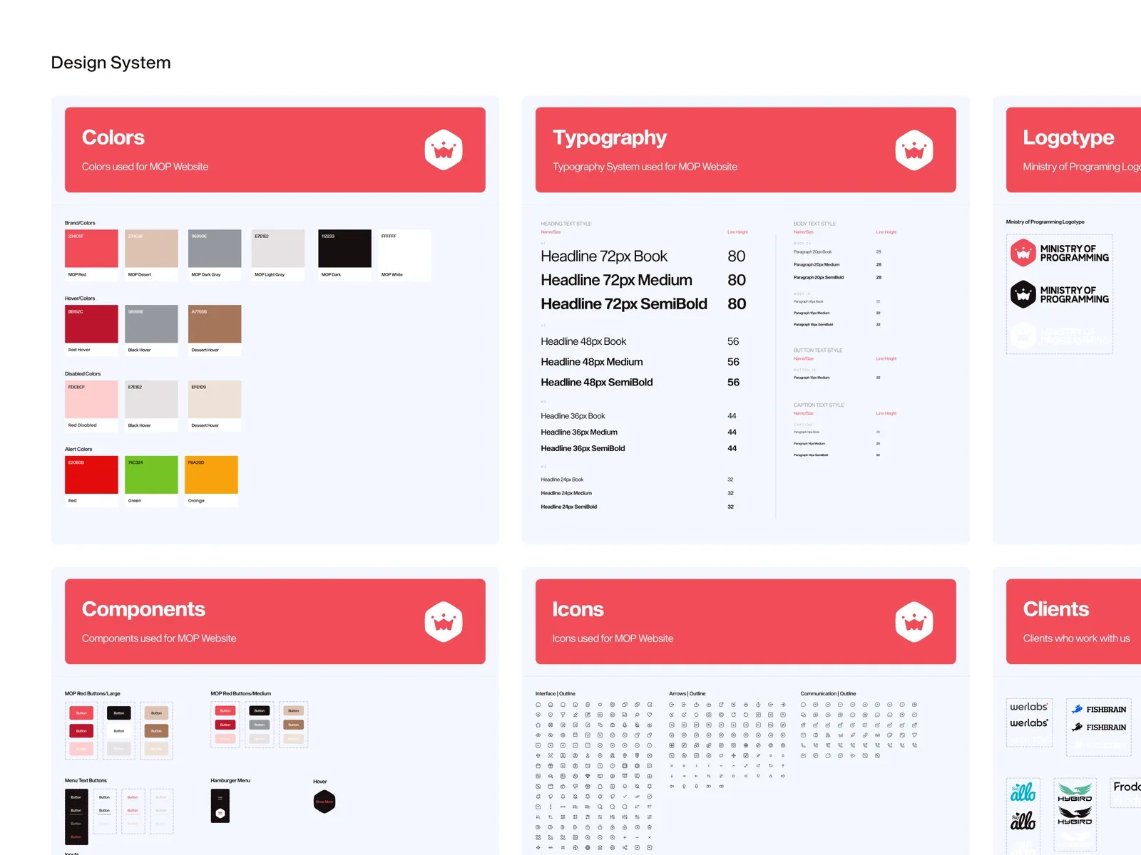
Step 3: Build The Design System Library
Set up shared libraries in design tools like Figma so everyone uses the same components. Include buttons, forms, color swatches, and typography styles.
Document how each component works and when to use it. This documentation helps new team members understand the system and make consistent choices.
Step 4: Roll Out In Phases
Apply your brand system gradually across different parts of your product. Start with high-traffic areas like your homepage or main navigation.
Monitor user behavior during the rollout. Look for changes in engagement, task completion rates, and user feedback that might indicate problems with the new system.
Accessibility And Inclusivity As Non Negotiables
Accessible design ensures your brand system works for users with different abilities and needs. This isn't optional, yet a fundamental requirement for any digital product.
WCAG Aligned Color And Type Choices
Test all color combinations against Web Content Accessibility Guidelines (WCAG) standards. Users with color vision deficiencies or low vision need sufficient contrast to read text and identify interactive elements.
Choose fonts that remain clear at different sizes and on different devices. Avoid decorative fonts for body text, and make sure your font choices support the languages your users speak.
Responsive And Device Agnostic Layouts
Your brand elements must work on phones, tablets, desktops, and emerging device types. Design components that adapt to different screen sizes while maintaining brand consistency.
Consider how your brand appears when users interact with voice assistants, smart watches, or other non-traditional interfaces.
Governance Measurement And Iteration After Launch
A brand system only works if teams actually use it correctly. Establish clear ownership and processes for maintaining consistency over time.
Assign Cross Functional Ownership
Different teams handle different aspects of your brand system. Design teams manage visual components. Content teams maintain voice and messaging guidelines. Product teams ensure new features follow established patterns.
Create a brand system manager role to coordinate between teams and make decisions about updates or exceptions.
Track Brand And UX KPIs
Monitor metrics that show how your brand system affects user behavior. Look at engagement rates, task completion times, and brand recognition scores.
User satisfaction surveys can reveal whether people find your product easier to use and more trustworthy after implementing the brand system.
Iterate With Analytics And User Feedback
Use data to identify which parts of your brand system work well and which need improvement. Analytics tools show how users interact with different components.
Regular user research helps you understand whether your brand system supports or interferes with user goals. Adjust elements based on this feedback while maintaining overall consistency.
Let’s Accelerate Your Product Journey, Together
Building a comprehensive brand system requires expertise in design, user experience, and technical implementation. Digital product specialists understand how to coordinate these different disciplines into a cohesive system.
We proven methodologies to help teams move efficiently from brand strategy to implementation. We work with startups and established companies to create brand systems that support business goals while delivering exceptional user experiences.
Ready to build a brand system that drives results?
This article is co-authored by Amra Začina, Co-Founder and CMO at Ministry of Programming, and Sanjin Halilović, Senior Product and Brand Designer. Together, they lead MOP’s branding services, helping startups create consistent, memorable digital experiences.
FAQs About Building A Digital Product Brand System
How much should a startup budget for developing a brand system?
Brand system investment varies based on product complexity and team size. Early-stage startups often allocate 10-20% of their design budget to brand system development, while established products may invest more in comprehensive systems.
Who maintains brand system consistency across design and development teams?
Brand system maintenance typically involves a dedicated brand system manager who coordinates between design, development, and content teams. This person ensures new features follow established guidelines and manages system updates.
How do AI design tools affect brand system maintenance workflows?
AI tools can automate routine tasks like generating brand assets and checking consistency across components. However, human oversight remains essential for strategic decisions and quality control of AI-generated elements.