Custom sheets for SwiftUI
Learn how to create custom sheets with dynamic height in SwiftUI, even for older iOS versions. Faris' guide walks through coding, animations, and customization tips to enhance your app’s user experience. Perfect for developers looking to elevate their SwiftUI skills.

Have you ever wanted to create a custom sheet with dynamic height in SwiftUI? Since Apple provides a native Sheet component, it is easy to use it for designing any type of custom sheet we need in our iOS app.
However, it wasn’t always like that. Older versions of iOS, such as iOS 14, don’t support this functionality. So, if your app supports those iOS versions, you don’t have the luxury of solving this problem seamlessly. But don’t worry! Once you read this article, you will be able to achieve sheets with dynamic height in any iOS that supports SwiftUI! Let’s give it a shot.
Creating custom sheets is not complicated at all. Just follow my steps.
Step 1: Create new view for bottom sheet
We first need to create a new SwiftUI View file, so we divide our code into various files. I called mine “BottomSheetView”, you can call yours what ever you like.
//
//  BottomSheetVie.swift
//  BottomSheet
//
//  Created by Faris Hurić on 10. 10. 2022..
//

import SwiftUI

struct BottomSheetView: View {
    var body: some View {
        Text("Hello, World!")
    }
}

struct BottomSheetVie_Previews: PreviewProvider {
    static var previews: some View {
        BottomSheetView()
    }
}
You should see something similar as a starting point. Let’s now begin to create.
Step 2: Coding view
Let’s create a simple VStack and add some view modifiers to it.
VStack {
	Text("Hello sheet!")
}
.frame(maxWidth: .infinity)
.background(.white)
Also, it’s important to note that this VStack needs to be embedded in another stack view because our bottom sheet needs to fill the entire screen. I will embed it into ZStack. Also let’s not forget to put white background on our VStack.
ZStack(alignment: .bottom) {
    VStack {
        Text("Hello sheet!")
    }
    .frame(maxWidth: .infinity)
    .background(.white)
}
.frame(maxWidth: .infinity, maxHeight: .infinity, alignment: .bottom)
.ignoresSafeArea()
Step 3: Create binding variable in parent view and pass it to our bottom sheet
Our bottom sheet should be visible only when triggered by some action.
So, let’s add some code to our sheet.
At the beginning of View add the following line:
@Binding var isShowing: BoolAnd if our “isShowing” is true, show our contents of ZStack.
struct BottomSheetView: View {

    @Binding var isShowing: Bool

    var body: some View {
            ZStack(alignment: .bottom) {
                if isShowing {
                    VStack {
                        Text("Hello sheet!")
                    }
                    .frame(maxWidth: .infinity)
                    .background(.white)
                }
            }
            .frame(maxWidth: .infinity, maxHeight: .infinity, alignment: .bottom)
            .ignoresSafeArea()
    }
}
Step 4: Call our BottomSheetView in parent view
It is important to mention that any parent view where you want to call our bottom view needs to have ZStack as root view stack. With help of ZStack our bottom sheet will “override content below it”.
In ZStack, in your parent view, just call your BottomSheetView. As you can remember from Step 3, we need to provide some binding bool to our BottomSheetView. So, create some binding variable at the start of parent view.
@State var isShowingBottomSheet: Bool = false
Also, I’ve created button which will toggle this bool. You can do it as well.
Button {
    isShowingBottomSheet = true
} label: {
    Text(“Show bottom sheet”)
}
.buttonStyle(.borderedProminent)
Step 5: Adding animations, background overlay and corners radius
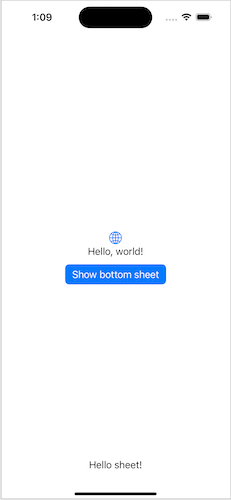
As you can see on screenshot above, our sheet looks horrible. Let’s improve it.
In our BottomSheetView ZStack above the VStack add the following code
Color.black
    .opacity(0.3)
    .ignoresSafeArea()
    .onTapGesture {
        isShowing = false
    }
With help of this little trick, we will achieve our background overlay and tapping outside sheet will close the sheet.
Also let’s add animations. To our ZStack add the following modifier:
.animation(.easeInOut)
and to our VStack add the following transition:
.transition(.move(edge: .bottom))
I will now present you a UI helper for rounded corners in SwiftUI.
Thanks to this helper, we can set border radiuses only for top corners.
// https://stackoverflow.com/a/58606176

struct RoundedCorner: Shape {

    var radius: CGFloat = .infinity
    var corners: UIRectCorner = .allCorners

    func path(in rect: CGRect) -> Path {
        let path = UIBezierPath(roundedRect: rect, byRoundingCorners: corners, cornerRadii: CGSize(width: radius, height: radius))
        return Path(path.cgPath)
    }
}

extension View {
    func cornerRadius(_ radius: CGFloat, corners: UIRectCorner) -> some View {
        clipShape( RoundedCorner(radius: radius, corners: corners) )
    }
}
The usage is really simple, just call it as regular ViewModifier and pass another parameter ‘corners’. Let’s add it to our code.
.cornerRadius(8, corners: [.topLeft, .topRight])If we don’t specify any height for our sheet, its height will be based on the contents in it. So for sake of this article, let’s provide some height on our sheet.
.frame(height: 250)
Conclusion
And there you have it! Now you can create any type of sheet you want for any SwiftUI-supported iOS and customize it to your liking.
There is lot of space to edit. You can add a title and aclosing button at the top.
I want to express my gratitude for all my knowledge and help with this story to, one and only Dino Trnka! Go check out his medium.
You can find whole starter project here: https://github.com/farishuric/BottomSheet
Thanks for your attention and happy coding! :)